Why it was needed
QuickPay is a friend's Nigerian wallet and bills app. When I opened the file there were 105 screens and no system behind them: more than 50 icon sets, about 1,400 unnamed layers, and orange and purple buttons competing on the same screen. Every new screen meant guessing which version was right. The goal was one source of truth that made the next screen faster, not just this redesign prettier.
How it's structured
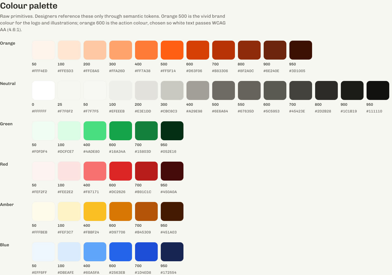
Three layers, and components only ever touch the last one. A raw colour never appears on a screen.
Orange 600#d63f06color-bg-brand#d63f06color-border-focus#d63f06Primary button · fillcolor-bg-brandInput · focus ringcolor-border-focusThe Figma file follows atomic design page by page: Foundations, Atoms, Molecules, Organisms, Templates, then Pages. Dark mode lives in the same variables as a second mode, so a screen switches theme without being redrawn.
Foundations
Semantic colour tokens, as they are named in Figma and exported to code:
color-bg-canvas#f7f6f2color-bg-surface#ffffffcolor-bg-brand#d63f06color-bg-brand-hover#b83306color-bg-brand-pressed#8f2a0ccolor-text-primary#2d2b28color-text-secondary#67635dcolor-bg-success#16a34acolor-bg-warning#d97706color-bg-danger#dc2626color-border-default#e3e1ddcolor-border-focus#d63f06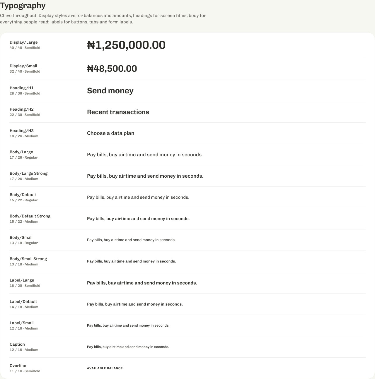
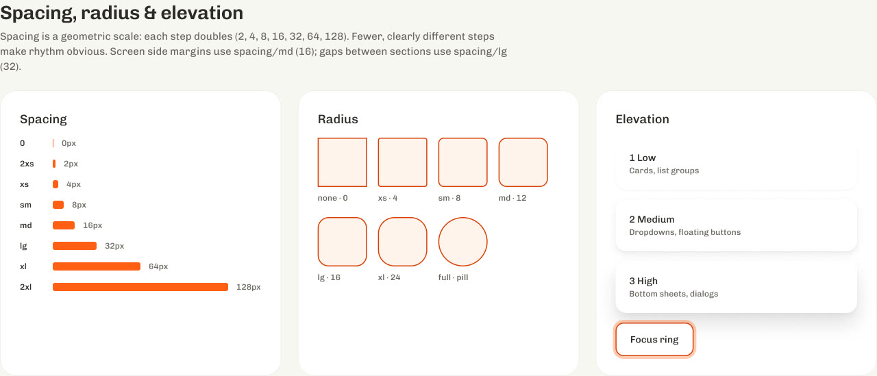
Components and states
52 components carry written descriptions in Figma, so anyone picking one up knows when to use it. Every flow covers more than the happy path: loading, pending, failed, limit reached and offline. One rule runs through all of them: every failure says whether money moved.
Documentation and governance
- Names that travel: a token's Figma name and its code name match, so
color-bg-brandmeans the same thing to a designer and an engineer. - One of everything: one icon set (Phosphor), one typeface (Chivo), one action colour.
- Findable: 690 layers renamed so engineers can inspect any screen and see what they're looking at.
- Checked: contrast tested on every text pair, then a stress test with worst-case data (long names, huge amounts, empty states).
What it changed
- Tertiary text contrast raised from 4.21 to 5.0, card labels from 2.59 to 4.59, glass hero text from 3.91 to 5.9
- 50+ icon sets down to one
- Two competing button colours down to one
- About 91 screens rebuilt on the system, in light and dark, with a clickable prototype of 4 flows
What shipped vs what was designed
Designed: the full system, about 91 screens and the prototype. Shipped: nothing in code yet. It's a Figma rebuild, and the app's team decides what gets built. There are no usage numbers, so there are none here.